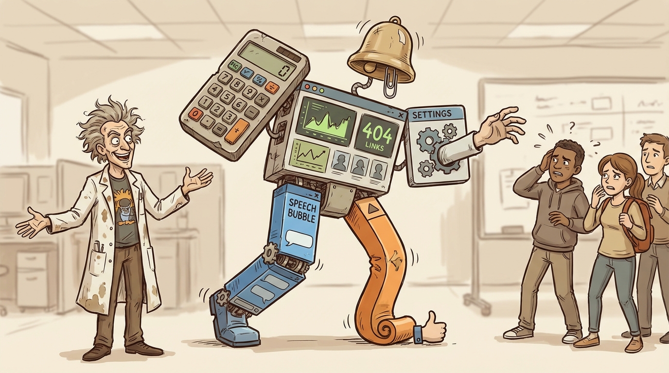
The Dangerous Mistake of Treating Features Like Separate Products
Fragmenting your product experience confuses users and tanks adoption. Here's how to integrate advanced features as natural progressions.
TL;DR
Advanced features should be tabs or sections within your product, not separate products. Fragmented experiences increase cognitive load, reduce feature discovery, and kill adoption by breaking the user’s mental model of what they’re using.
Who This Is For
SaaS founders and product designers building apps with multiple features or advanced capabilities.
The Core Problem
Treating features like standalone products creates disconnected user experiences. Users can’t find features, don’t understand how they relate, and abandon the product because navigation is confusing.
You built a recommendation engine. It suggests products to customers based on browsing behavior.
Then you added customization options. Advanced settings for how recommendations display.
You put customization in a separate section. Different navigation. Separate interface. Feels like a different product.
Users can’t find it. The ones who do don’t understand how it connects to recommendations. Your feature adoption drops because the experience is fragmented.
This happens constantly in SaaS products. Founders treat advanced features like separate products instead of extensions of the core offering.
The Core Product Confusion
Every product has a core function. The primary reason someone installs it.
For a recommendation app, the core is showing relevant products to customers. That’s the value proposition. That’s what gets merchants to install.
Advanced features support that core function. They don’t replace it. Customization options let merchants control how recommendations appear. Analytics show which recommendations work. A/B testing optimizes performance.
These features enhance the core. They don’t stand alone.
But when you design them as separate products with separate interfaces and separate navigation, users think they’re separate. They don’t connect them to the core function.
Someone uses your recommendations. Works fine. But they never find the analytics because it’s buried in a different section with its own dashboard.
You built the feature. But nobody uses it because nobody knows it exists or how it relates to what they’re already doing.
The Navigation Problem
Fragmented products create navigation problems.
User installs your app. Opens the dashboard. Sees the main feature. Uses it. Closes the app.
The advanced features exist somewhere else. Behind a different tab. In settings. In a separate dashboard. The user never sees them.
Maybe you added labels. “Advanced Options.” “Pro Features.” But the user doesn’t click because they’re not looking for something else. They’re using your app for the thing they installed it for.
Navigation should reveal functionality as users need it. Not hide it behind labels that sound optional.
The Mental Model Break
Users build mental models of products. This app does X. I open it to do X.
When you treat features like separate products, you break that model.
The user thinks they’re using a recommendation app. Then they discover analytics exists in a separate place with a separate interface. Now they have to rebuild their mental model. “Is this two products? Do they connect? Why are they separate?”
That cognitive load kills adoption. Users don’t want to figure out your product architecture. They want to accomplish a task.
If your analytics feel disconnected from your recommendations, users won’t connect them. They’ll use recommendations and ignore analytics. Or worse, they’ll abandon the product because it feels complicated.
Integration as Tabs
The fix is simple. Treat advanced features as tabs within the main product.
Your main dashboard shows recommendations. Add a tab for analytics. Add a tab for customization. Add a tab for A/B testing.
Same interface. Same navigation. Same context.
Now when a user opens your app, they see everything in one place. They understand that analytics shows data about recommendations. Customization controls how recommendations appear. A/B testing optimizes which recommendations work.
The relationship between features is obvious because the interface shows it.
Progressive Disclosure
Not every user needs every feature immediately. New users need the basics. Advanced users need deeper functionality.
Progressive disclosure means showing features as users need them. Don’t hide them in separate products. Reveal them in context.
A new user sets up recommendations. The interface shows options to customize appearance once recommendations are running. It prompts analytics after they have data to analyze.
This is different from fragmenting features into separate products. You’re still showing everything in one place. But you’re guiding users to features when they’re relevant.
The Settings Trap
Advanced settings are a common place where this breaks down.
You build a product. Core functionality lives in the main interface. Advanced options go in settings. Settings feels like a different product because it’s structured differently.
Users who need those advanced options struggle to find them. The ones who do find them don’t understand how changing a setting affects the core product because the connection isn’t visible.
Better approach: put settings in context. If a setting affects how recommendations display, put it on the customization tab where users control display options. If it affects performance, put it with analytics where performance is measured.
Settings should live where they’re relevant, not in a separate graveyard labeled “Advanced.”
Feature Discovery
When features feel like separate products, discovery breaks.
A user might love your core product but never find the feature that would make them love it more. They don’t know it exists because it’s not integrated into their workflow.
You’re leaving value on the table. You built functionality that could increase retention or expansion revenue. But users don’t find it because it’s not discoverable.
Integration increases discovery. When users see tabs in your main interface, they explore. When features are hidden behind separate navigation or in settings, they don’t.
The Product Story
Your product tells a story. The interface guides users through that story.
For a recommendation app, the story is: show relevant products to increase sales. Customize how they appear. Analyze what works. Optimize based on data.
That’s a coherent narrative. Each step builds on the previous one.
When you fragment features into separate products, you break the narrative. Recommendations exist here. Customization lives there. Analytics are somewhere else. The user has to piece together the story themselves.
Most won’t. They’ll use the first thing they find and ignore the rest.
When Separation Makes Sense
Occasionally, features genuinely are separate products. If you have two distinct value propositions that serve different use cases, they might warrant separation.
An email marketing platform and a CRM are different products even if they integrate. They serve different purposes. Users might use one without the other.
But most SaaS products don’t have this. They have one core function and multiple features that enhance it.
Product recommendations is one product. Customization, analytics, and testing are features within that product. Not separate products.
If users would be confused by having both or if one works independently of the other, consider separation. Otherwise, integrate.
Implementation
Integrating features doesn’t require rebuilding your product from scratch.
Start with navigation. Add tabs to your main interface. Move features from separate pages into those tabs. This immediately makes the product feel more cohesive.
Standardize interface patterns. Use the same design language across all features. If your main product uses cards for content, your analytics should too. Consistency signals that everything belongs together.
Show relationships. When a user views analytics, link to the recommendations they’re analyzing. When they customize display, show a preview using their actual recommendations. Make the connections explicit.
Guide users. After someone sets up recommendations, prompt them to view analytics or customize appearance. Don’t wait for them to discover features. Show them when they’re relevant.
The User Test
Here’s how to know if your product is fragmented:
Watch a new user set up your app. Don’t give them instructions. Just observe.
Do they find your advanced features? Do they understand how features relate to each other? Or do they get confused about where to find things?
If users can’t navigate your product intuitively, you’ve probably fragmented it.
Better yet, ask them to explain what your product does after using it for ten minutes. If they describe only the core feature and don’t mention advanced functionality, it’s not integrated well enough.
Cognitive Load Matters
Every separate interface increases cognitive load. Users have to remember where things are. They have to switch contexts. They have to rebuild understanding of what they’re looking at.
That load adds up. Most users won’t tolerate it. They’ll use the simplest path and ignore everything else.
Reducing cognitive load means putting related functionality together. When everything lives in one place with consistent navigation, users don’t have to think about structure. They just use the product.
Frequently Asked Questions
How many tabs are too many in one interface?
Five to seven tabs is usually manageable. Beyond that, consider if some tabs should be grouped or if you’re trying to do too much in one product. Users should be able to scan tabs and understand what’s where without scrolling.
Should free and paid features be separate?
No. Show paid features with upgrade prompts. Let users see what’s available even if they can’t access it yet. This is progressive disclosure - users understand the product’s full capabilities and know what they get by upgrading.
What about mobile vs desktop navigation?
Keep the same structure but adapt the layout. Tabs might become a bottom navigation bar on mobile or a hamburger menu. But the organization should be consistent. Users should find things in the same place regardless of device.
How do I handle features with completely different interfaces?
If a feature genuinely requires a different interaction model, it might warrant separate treatment. But ask if the different interface is necessary or just legacy architecture. Most features can adapt to the main product’s interface patterns with some design work.
Can I have sub-features within tabs?
Yes, but keep it shallow. Main tab → sub-sections works. But don’t create deep hierarchies. If users need three clicks to reach functionality, it’s too buried. Two levels max is a good rule.
Key Takeaways
- Tabs instead of separate products: Advanced features should be tabs within the main interface, not separate dashboards - this makes relationships between features obvious and increases discovery.
- Reduce cognitive load through consistency: Use the same design patterns and navigation across all features so users don’t have to rebuild their mental model for each section.
- Guide users when features become relevant: Progressive disclosure shows advanced functionality in context rather than hiding it in separate products users never find.
Your product should tell one clear story. Every feature should support that narrative.
When you fragment features into separate products, you’re making users do the integration work. They have to figure out how things connect. Most won’t bother.
Keep it together. Make it coherent. Let the interface show relationships instead of hiding them.
That’s how you get features adopted. Not by building them, but by making them discoverable and understandable within the product users are already using.
Ohad Michaeli
Strategic positioning for Shopify apps
Want more insights like this?
Join Shopify app founders who get actionable positioning and optimization strategies.