Why Boring Tutorial Videos Are Killing Your Product Adoption
Users have zero patience for slow product tutorials. Here's how to create tight, purposeful education that doesn't waste their time.
TL;DR
Most product tutorials are unnecessarily slow and meandering. Users need tight, purposeful education that respects their time - consistent terminology, tooltips for complexity, and clarity over comprehensiveness.
Who This Is For
SaaS founders and customer education teams responsible for onboarding and product tutorials.
The Core Problem
Slow, comprehensive tutorials waste user time and kill engagement. Users abandon products when education feels like homework instead of rapid enablement.
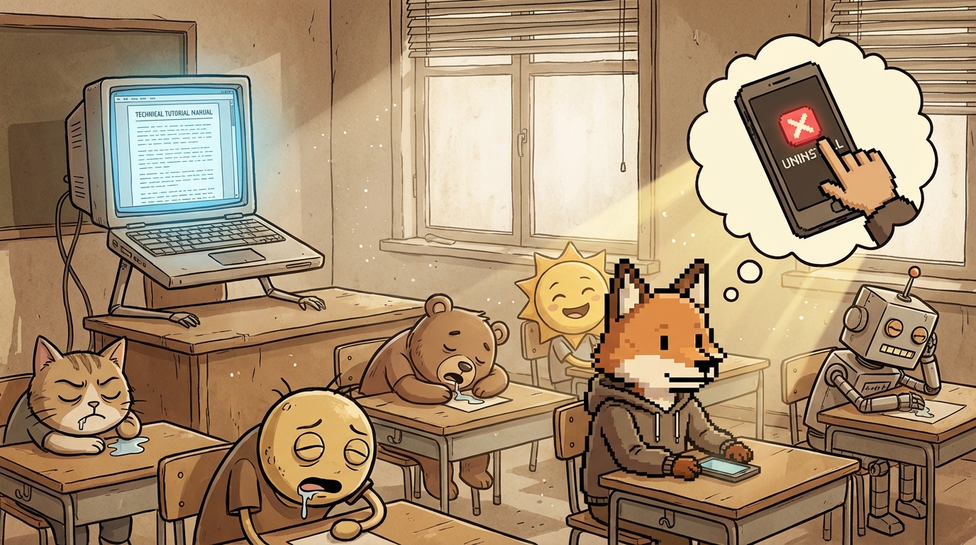
Your tutorial video is eight minutes long. It covers everything. Setup, features, edge cases, best practices. You walk through every screen. Explain every option.
Users watch at 2x speed. Or they don’t watch at all.
You think you’re being thorough. You’re actually being boring.
Here’s the reality: if someone who knows your product space finds your tutorial tedious, your actual users are already gone.
The Time Problem
Users don’t have time to watch eight-minute videos. They have a business to run. They installed your app to solve a problem. They want to solve it now.
Every minute of tutorial is a minute they’re not getting value. Every explanation that could be half as long is wasted time.
Speed matters. Not because users are impatient. Because they’re busy.
A four-minute tutorial that teaches everything essential beats an eight-minute tutorial that teaches everything possible. The goal is enablement, not exhaustive documentation.
What Makes Tutorials Boring
Explaining obvious things. If your interface is clear, you don’t need to narrate what buttons do. Users can see that. Skip it.
Going too slow. Pausing between sentences. Repeating points. Taking too long to get to the actual functionality. Users tune out.
Showing every path. You don’t need to demonstrate every possible way to accomplish something. Show the most common path. Mention alternatives exist. Move on.
Meandering structure. Starting with context instead of the core action. Wandering through setup that should take ten seconds. Not respecting the user’s time.
Over-explaining. Five sentences when one would do. Multiple examples when one is enough. The tutorial becomes a lecture instead of enablement.
The 30-Second Test
Here’s the test: Can you explain your core feature in 30 seconds?
Not every detail. Just what it does and how to use it.
If you can’t, the problem is probably your product complexity, not the tutorial length. But if you can explain it in 30 seconds in person, your tutorial should match that speed.
Users don’t need comprehensive. They need sufficient.
Sufficient means they can start using the feature. Questions will come up. That’s fine. Answer those with docs or tooltips. Don’t preemptively explain everything that might be confusing.
Tight Structure
Good tutorials have clear structure:
Show the outcome first. What will they be able to do after watching this? Lead with that. Users need to know if this tutorial is worth their time.
Get to the action immediately. No preamble. No context. Start with the first step.
Use consistent terminology. If you call something a “campaign” in one place, don’t call it a “sequence” in another. Inconsistent language forces users to figure out if you’re talking about the same thing.
Skip what’s obvious. If your UI labels are clear, you don’t need to read them aloud. Trust users to read.
End when done. Don’t add “and here are some other features” at the end. Make separate tutorials for separate features.
Video vs Text vs Tooltips
Not everything needs video.
Video for workflows. When multiple steps connect, video shows the flow. How one action leads to another. The relationship between parts.
Text for reference. When users need to look something up later, text wins. Searchable. Scannable. Faster to reference than scrubbing through video.
Tooltips for complexity. When one part of the interface needs explanation, a tooltip is better than making users watch a video or read docs. Context-sensitive help beats external education.
Most products over-invest in video and under-invest in tooltips. Users need help in the moment, not after watching a tutorial.
Consistent Terminology Matters
This kills more tutorials than slow pacing: inconsistent language.
You call a feature “product recommendations” in your marketing. “Suggested products” in the interface. “Related items” in the tutorial.
Users think these are three different things. They get confused about what they’re looking at.
Terminology consistency across marketing, interface, and education is critical. Pick one name for each concept. Use it everywhere.
This seems obvious. But most products violate this constantly. Check your app right now. Do your labels match your docs match your tutorials?
Probably not.
The Re-watch Test
If users need to pause and rewatch sections of your tutorial, something’s wrong.
Either you’re going too fast, explaining poorly, or showing too much at once.
Good tutorials can be watched once at 1x speed and understood. Users shouldn’t need to pause or rewatch unless they stepped away.
If you’re getting feedback that tutorials are confusing, the problem is probably structure, not comprehensiveness. Slowing down and adding more explanation makes it worse.
Just-in-Time Education
The best education happens when users need it.
Show a tooltip when they hover over a complex feature. Link to a quick video when they access advanced settings. Provide help in context instead of making them complete tutorials before using the product.
Upfront tutorials try to teach everything before users have context for why it matters. That’s backwards.
Let users start using the core feature immediately. Provide education as they encounter complexity.
This is why tooltips matter. They catch users at the exact moment they need help. A tooltip that says “This setting controls how often recommendations refresh” is more valuable than a tutorial that mentions refresh settings as part of explaining twenty other things.
The Efficiency Challenge
Time your current tutorials. How long do they actually take?
Now cut that time in half. Can you teach the same core concepts in half the time?
Usually yes. By removing:
- Introductions and context-setting
- Redundant explanations
- Demonstrations of obvious UI
- Tangential information
- Slow pacing between points
What’s left is the essential information. That’s your tutorial.
If you can’t cut it in half, you’re probably trying to teach too much in one video. Split it into multiple focused tutorials.
Purposeful Over Comprehensive
Comprehensive tutorials try to answer every question. Purposeful tutorials answer the questions users actually have.
Those aren’t the same thing.
Users have three questions when learning your product:
- What does this do?
- How do I use it?
- What happens if I mess up?
Answer those three. Stop there.
Everything else can live in documentation for when users need it. Not everyone needs advanced tips. Not everyone needs edge case handling. Most users need the basics to work.
Comprehensive tutorials overwhelm users with information they don’t need yet. Purposeful tutorials get them working, then point them to resources when they’re ready for more.
Audio Quality Matters More Than Video
If you’re recording tutorials, invest in a decent microphone. Audio quality matters more than video quality for instructional content.
Users can handle lower resolution video. They can’t handle audio that’s hard to understand. Unclear audio forces users to rewind and listen multiple times. That’s the same problem as slow tutorials - wasting time.
You don’t need expensive equipment. But the built-in laptop mic probably isn’t good enough. A $50 USB microphone makes a significant difference.
Test With New Users
The only way to know if your tutorial works is to watch new users try to follow it.
Don’t explain anything. Just give them the tutorial and observe.
Do they get stuck? Where? Do they look confused? When? Do they skip ahead? That tells you what’s unnecessary.
Most founders create tutorials based on what they think users need to know. Then they never validate whether users actually need all that information.
Test your tutorials with people who’ve never seen your product. Their confusion points tell you where to clarify. Their skipping tells you what to cut.
Frequently Asked Questions
Should I create one comprehensive tutorial or multiple short ones?
Multiple short ones. Users want to find the specific information they need, not watch an entire tutorial to find one answer. 2-3 minute focused tutorials beat one 15-minute comprehensive video.
What if my product is genuinely complex?
Complexity doesn’t justify slow tutorials. It might justify more tutorials covering different aspects. But each individual tutorial should still be tight and purposeful. Break complexity into digestible pieces, don’t make tutorials longer to cover it.
Should I show shortcuts and advanced techniques in tutorials?
No. Basic tutorials should cover the standard path. Create separate “advanced tips” tutorials for users who’ve mastered the basics. Don’t overwhelm new users with optimizations they’re not ready for.
How often should I update tutorials when my product changes?
Update when the change makes the tutorial incorrect or confusing. Don’t recreate tutorials for minor UI tweaks. But if you change workflow or terminology, update immediately. Outdated tutorials are worse than no tutorials.
Should I include text transcripts with video tutorials?
Yes. Some users prefer reading. Text is searchable and skimmable. It’s also better for accessibility. Create the script first, record the video from it, and publish both. The script becomes your transcript.
Key Takeaways
- Cut tutorial length in half: Remove introductions, redundant explanations, obvious UI demonstrations, and slow pacing - users need sufficient information to start, not comprehensive coverage of everything.
- Consistent terminology is critical: Pick one name for each concept and use it everywhere - inconsistent language makes users think they’re looking at different features.
- Just-in-time beats upfront: Tooltips and contextual help when users need it work better than comprehensive tutorials before users understand why the information matters.
Your tutorials should respect users’ time.
They didn’t install your product to watch videos. They installed it to solve a problem.
Get them solving that problem as fast as possible. Provide education when they need it, not all at once upfront.
Tight, purposeful, fast. That’s what good education looks like.
If you’re watching your own tutorials at 2x speed, your users are skipping them entirely.
Ohad Michaeli
Strategic positioning for Shopify apps
Want more insights like this?
Join Shopify app founders who get actionable positioning and optimization strategies.