Why Tiered Features Are Your Secret Upsell Weapon
Users can't want what they can't see. Here's how to use feature visibility to create natural upgrade motivation without being pushy.
Most SaaS pricing pages show three tiers with different feature lists. Users pick a tier based on what they need today.
The problem: users don’t know what they don’t know.
Features they’ve never experienced can’t drive upgrade desire. They’re abstract checkmarks on a comparison table, not tangible value they’re missing.
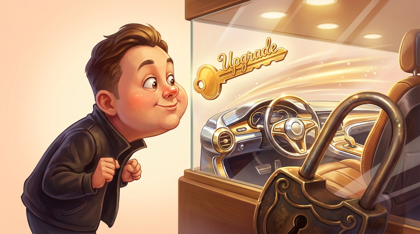
The smartest apps handle this differently. They don’t just list premium features. They show them, create curiosity, and let users feel what they’re missing.
The Visibility Principle
Here’s the insight: users can’t want what they can’t see.
If your premium features are completely hidden until someone upgrades, the only motivation to upgrade is trusting your marketing copy. That’s a weak driver.
But if users can see premium features, interact with them in limited ways, or understand exactly what they’d unlock, the motivation becomes concrete. They’re upgrading for something they’ve already experienced wanting.
This is the core principle behind effective tier strategy. Make the value of higher tiers tangible, not theoretical.
Showing Without Giving
There are several ways to make premium features visible without giving them away:
Locked but visible. The feature appears in the interface with a clear “upgrade to unlock” indicator. Users see it every time they use the app. Curiosity builds.
Limited access. Let users try premium features with restrictions. Maybe they get three exports per month on the free tier, with unlimited on paid. They experience the value while feeling the constraint.
Preview mode. Show what premium outputs would look like without providing the full functionality. “Here’s what your advanced analytics would show. Upgrade to access.”
Usage triggers. When a user’s activity suggests they’d benefit from premium features, surface those features contextually. “You’ve scheduled 10 posts this month. Premium gives you unlimited scheduling.”
Each approach has tradeoffs. The right choice depends on your specific product and user behavior.
Creating the Curiosity Gap
The goal isn’t to frustrate users. It’s to create a curiosity gap, the space between what they have and what they could have.
Done poorly, this feels manipulative. Users sense they’re being manipulated into upgrades and it breeds resentment.
Done well, it feels like discovery. Users realize the app can do more than they initially needed, and they have the option to unlock that capability when it becomes valuable.
The difference is often timing and framing. Show premium possibilities when users are succeeding with current features, not when they’re struggling. Frame upgrades as new capabilities, not artificial limitations.
The Tier Structure
Effective tiered pricing usually has clear logic to each level:
Entry tier. Core functionality that lets users achieve the primary use case. Should provide real value, not feel crippled.
Growth tier. Additional features that become valuable as usage increases or business grows. The natural next step for successful users.
Premium tier. Advanced capabilities for power users or larger operations. Often includes priority support, custom options, or enterprise features.
Each tier should feel complete at its level. Users on the entry tier shouldn’t feel like they’re using a broken product. They should feel like they’re using a product that could do more when they’re ready.
Upgrade Psychology
Understanding why users upgrade helps you design better tier experiences.
Growing need. Their business expanded and they hit the limits of their current tier. This is the ideal upgrade path: success-driven.
New use case. They discovered the app can solve problems they weren’t initially using it for. A premium feature addresses this new need.
Frustration with limits. They keep hitting constraints and decide the friction isn’t worth it. This works but creates less goodwill than success-driven upgrades.
Social proof. They see others using premium features effectively and want the same capabilities.
Design your tier visibility to trigger the first two motivations more than the third. You want users upgrading because they’re succeeding and want more, not because they’re frustrated with artificial limitations.
The Gamification Option
Some apps add achievement or progress mechanics to the upgrade path.
“You’ve completed 100 projects with Basic. Unlock Advanced to access templates, automation, and more.” The milestone frames the upgrade as earning a new level rather than just buying more features.
This doesn’t work for every product. B2B enterprise software probably shouldn’t feel game-like. But for certain markets and products, progress mechanics align upgrade psychology with natural human motivation.
Measuring Tier Effectiveness
Watch these signals to understand how your tier strategy is performing:
Tier distribution. What percentage of users are on each tier? If everyone clusters at free or entry-level, your value proposition for higher tiers isn’t landing.
Time to upgrade. How long do users typically spend at each tier before upgrading? Very short times might indicate your free tier is too limited. Very long times might mean premium value isn’t compelling.
Upgrade triggers. What actions precede upgrades? Understanding this helps you surface the right features at the right moments.
Churn by tier. Do upgraded users stay longer? If premium tiers have higher churn, there’s a value gap between expectation and experience.
Avoiding Common Mistakes
Some tier strategies backfire:
Making free tier useless. Users who never experience value never become advocates or upgraders. Give them enough to succeed at something.
Hiding premium too completely. If users don’t know what they’re missing, they won’t miss it. Visibility creates desire.
Too many tiers. Complexity creates confusion. Most products work best with three tiers, maybe four.
Misaligned limits. If upgrade triggers don’t match natural usage patterns, users hit walls at frustrating moments rather than successful ones.
The best tier strategies feel natural. Users graduate through levels as their needs grow, each upgrade feeling like an obvious next step rather than a reluctant concession.
Make potential value transparent, and the upgrades take care of themselves.
Ohad Michaeli
Strategic positioning for Shopify apps
Want more insights like this?
Join Shopify app founders who get actionable positioning and optimization strategies.